

OPENGRIP • BRANDING
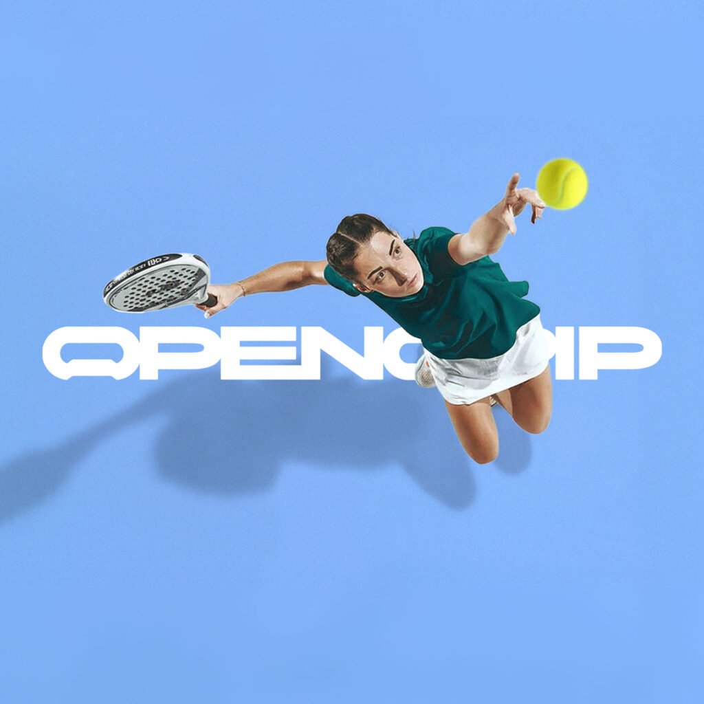
OPENGRIP about. OPENGRIP nace de una idea sencilla: alargar la experiencia del juego más allá de la pista. La marca se construye alrededor de ese momento compartido que no aparece en el marcador, pero que forma parte esencial del juego. Su propuesta toma forma en un objeto concreto: un abridor inspirado en el mango de […]
SESENA • BRANDING
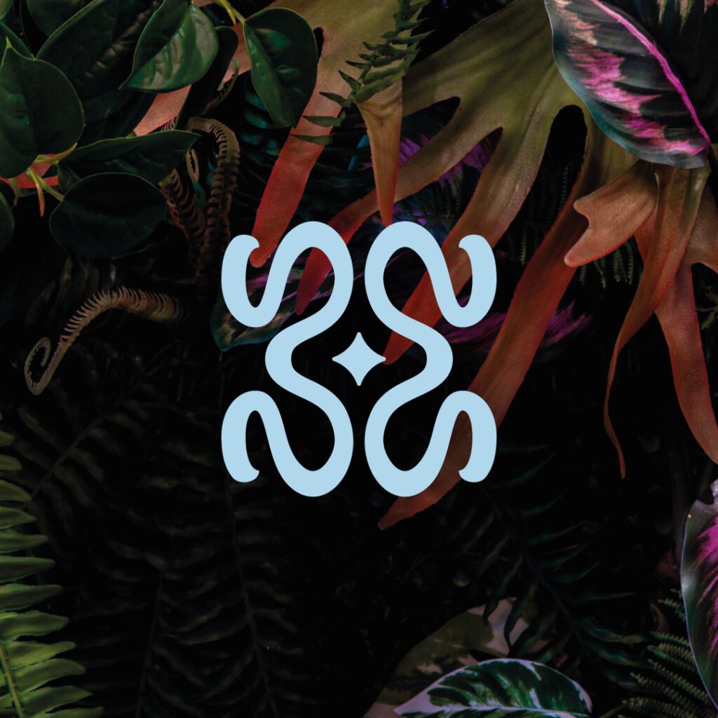
SESENA about. SESENA Lawn Services is a premium landscaping service focused on the care and maintenance of outdoor spaces with a high standard of quality. The brand is built on order, precision, and trust, moving away from generic industry practices to convey professionalism and meticulous attention to detail. The result is a solid, elegant, […]
JEM CAR SPA • BRANDING

JEMCAR SPA about. Este proyecto de car detailing nació con la idea de transformar el cuidado del automóvil en una experiencia premium. El trabajo de identidad se centró en reflejar limpieza, precisión y confianza, transmitiendo la dedicación y el nivel de detalle que caracterizan el servicio. A través de un diseño moderno y elegante, la […]
THE MONARCHY • BRANDING
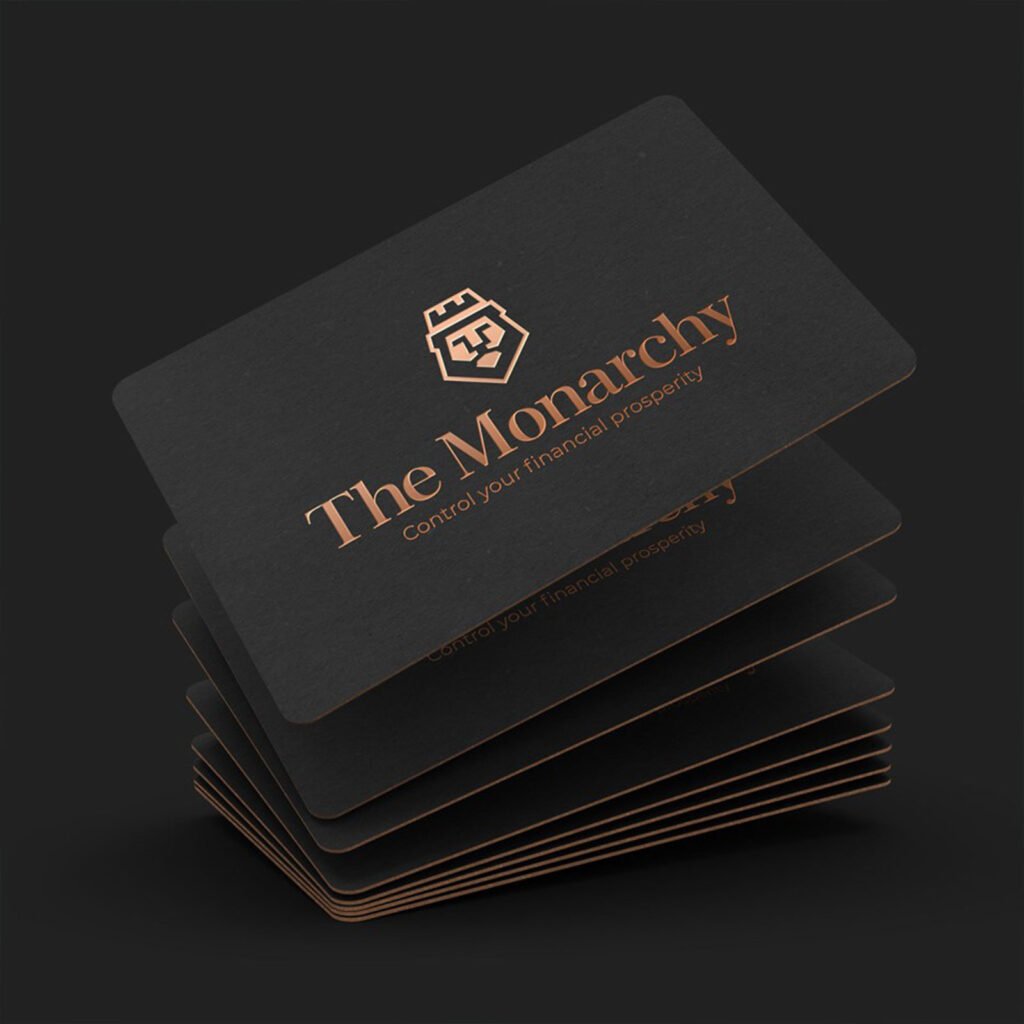
THE MONARCHY about. Branding for The Monarchy, a finance and insurance company, projecting authority and confidence. The logo of a crowned lion symbolizes leadership, strength, and prestige, while the dark gold, black, and white palette conveys sobriety and professionalism. A solid and elegant identity that reinforces its position as a leader in […]
MADOR • BRANDING
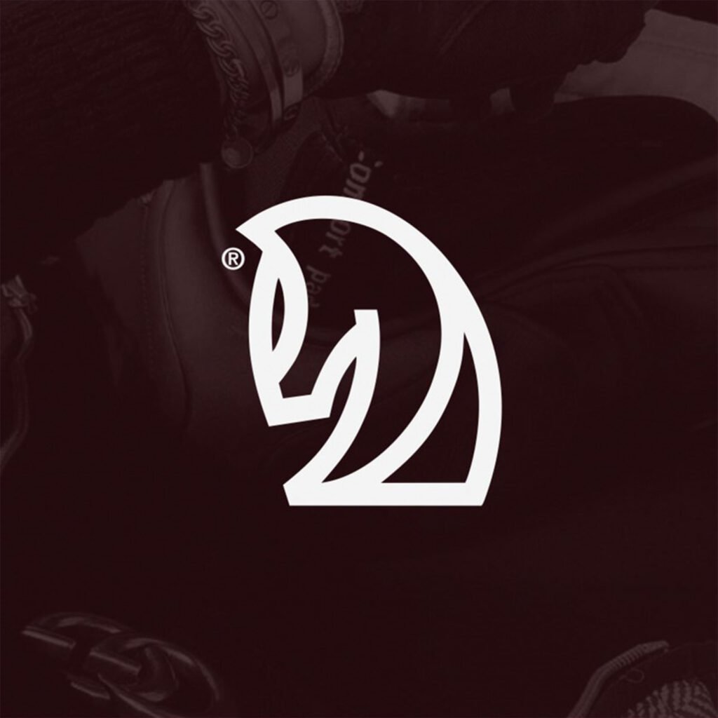
MADOR about. Branding for Mador, a racehorse care and training business, conveys elegance and prestige. The stylized horse logo symbolizes strength and speed, while the burgundy and gold palette provides exclusivity. A coherent and sophisticated visual identity that connects with the high-performance equestrian world.
TIPTOP PERFECTION • BRANDING

TIP TOP PERFECTION about. Branding for Tiptop Perfection, a cleaning and home organization business, conveys professionalism and freshness. The logo combines a house and a check mark, reflecting impeccable cleanliness. Gradients of blue evoke order and serenity, while the modern typography conveys a sense of closeness. The visual identity is coherent, versatile, and easily recognizable.
PCB TRADING SERVICES • BRANDING
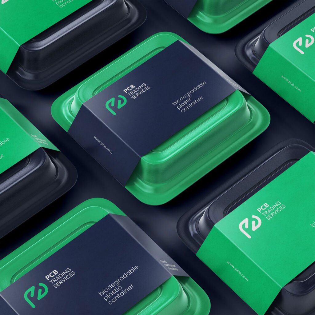
PCB TRADING SERVICES about. Branding for PCB Trading Services, a sustainable packaging company, focused on conveying innovation and environmental commitment. The modern and minimalist logo is accompanied by a green and navy blue palette that reflects freshness, confidence, and ecological responsibility. The clean and consistent design of the biodegradable packaging reinforces the identity […]